BONOT CALCALA
Branding / Visual identity
Bonot Calcala (Building Economy) is a new program by the Bonot Alternative movement aimed at supporting women's economic participation and driving the Israeli economy forward.
Their activities focus on promoting a community of entrepreneurial women, offering various professional workshops, creating a marketplace for women-owned businesses, and more.
Their activities focus on promoting a community of entrepreneurial women, offering various professional workshops, creating a marketplace for women-owned businesses, and more.
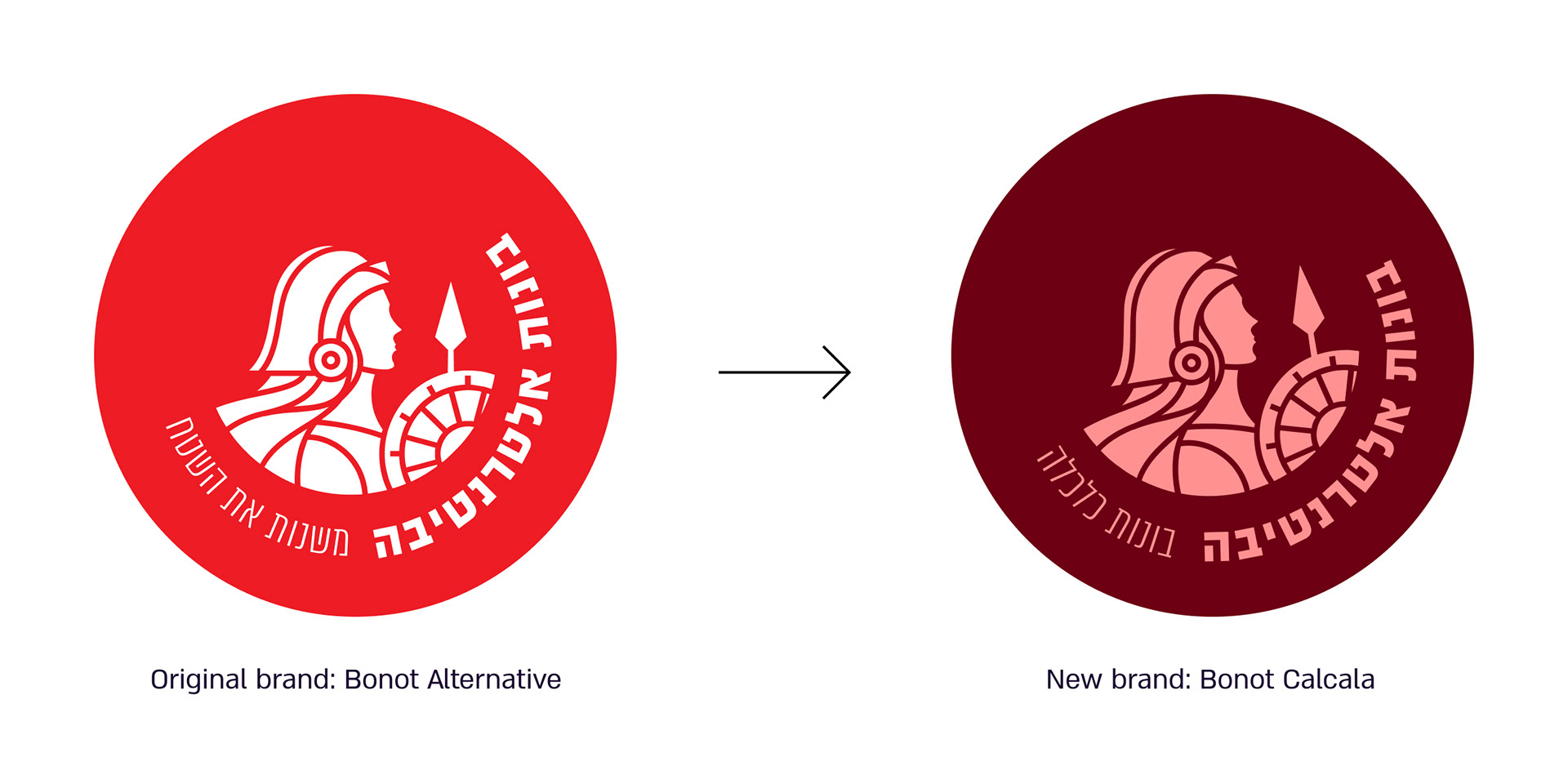
Bonot approached us to create a new, fresh brand language for them in a short timeframe. This language is based to some extent on the parent brand ("Bonot Alternative") but expands it from the realm of protest movements, emphasizing new values: originality, creativity, optimism, and versatility.
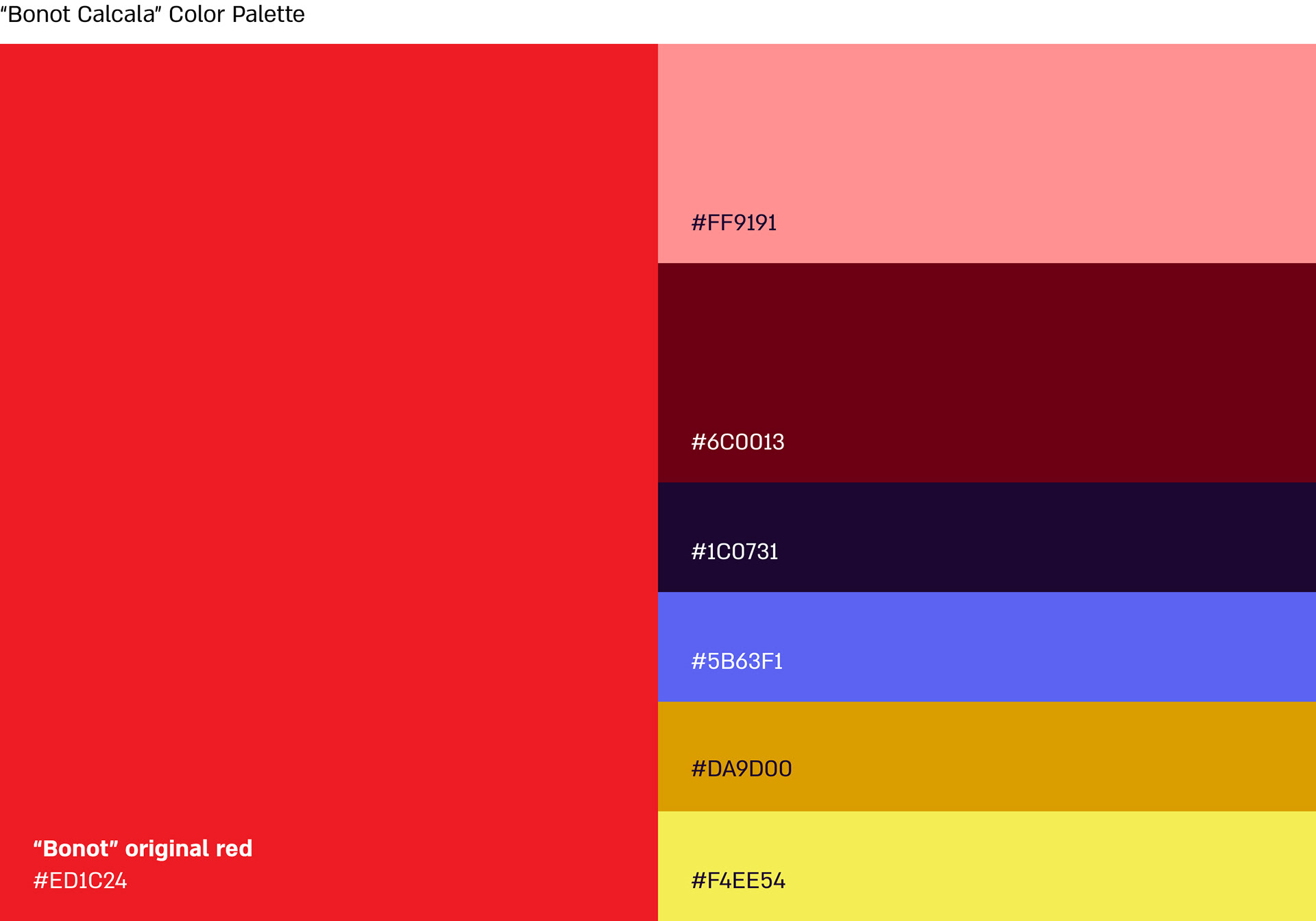
Along with Bonot's original red color, we created a broad and user-friendly color palette. Additionally, we kept the brand's original "Almoni" font but established clear guidelines for its use.
We also created icons from the technical and economic realms and complemented them with a fun, pleasant, and personal illustrative language.
We also created icons from the technical and economic realms and complemented them with a fun, pleasant, and personal illustrative language.
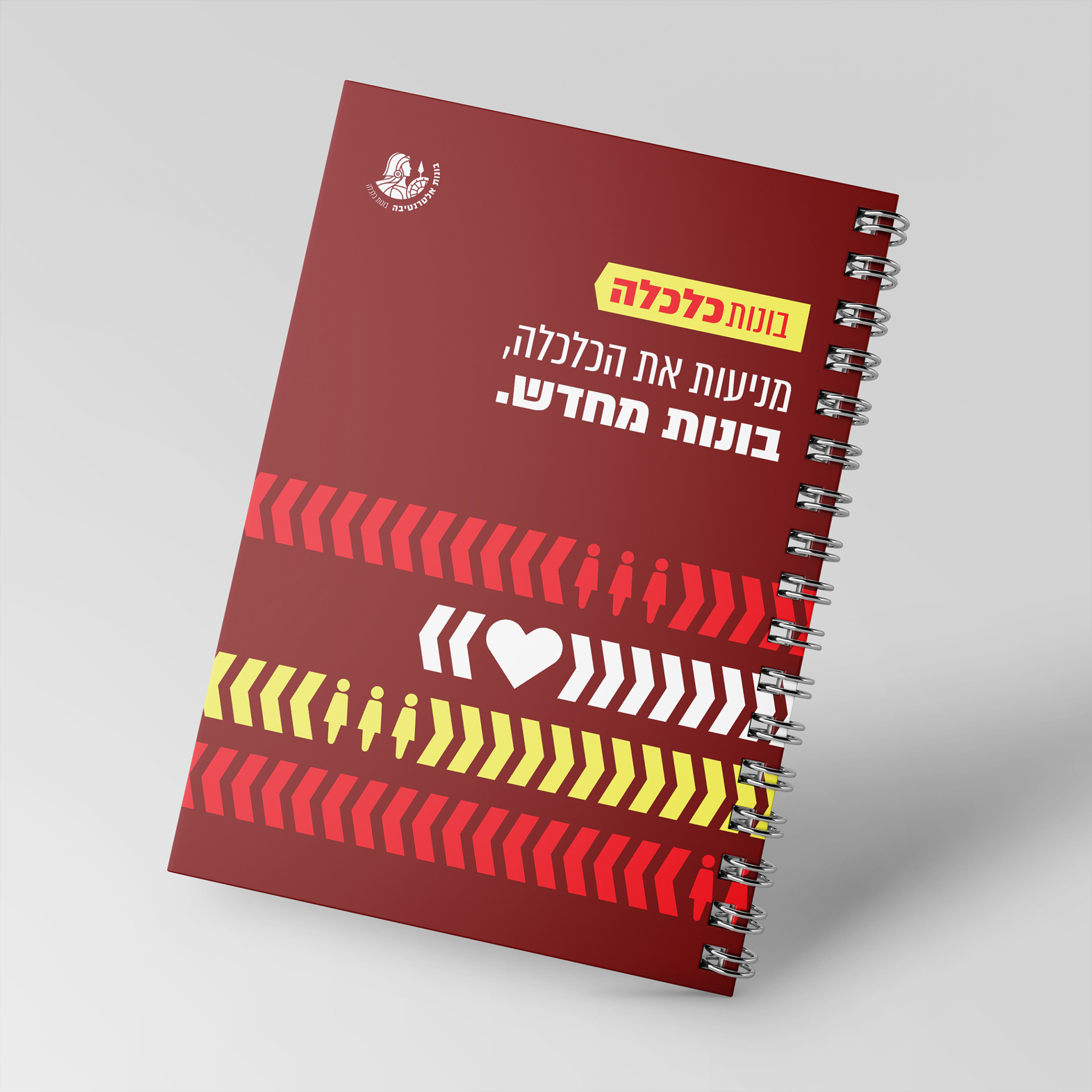
In summary, we developed a comprehensive, practical, and unique set of branding tools that builds upon the parent brand while also distinguishing itself. It's easy to implement across various platforms—social media, marketing materials, websites, print media, and merchandise.
* Done at Anzelevich Studio, illustrations by Yuval Yitzhak
